BrewHaus – Coffee Shop Brand Identity
BrewHaus is a bold yet cozy coffee brand concept designed to feel like your favorite local café.
Rooted in warm tones, structured type, and nostalgic charm, this identity explores how thoughtful design can shape the way we experience everyday rituals.
BrewHaus – Coffee Shop Brand Identity
BrewHaus is a bold yet cozy coffee brand concept designed to feel like your favorite local café.
Rooted in warm tones, structured type, and nostalgic charm, this identity explores how thoughtful design can shape the way we experience everyday rituals.
Project Overview
What I did
Design Style
Tools Used
Outcome
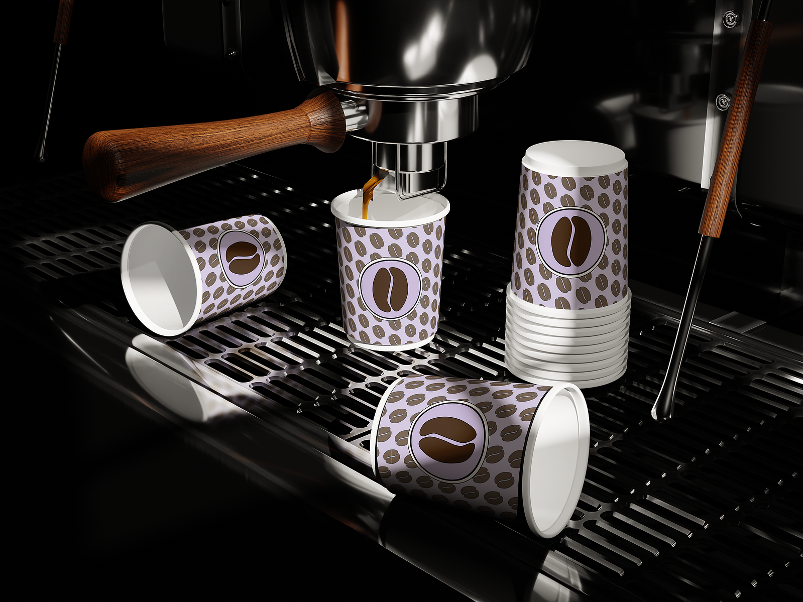
BrewHaus is a fictional coffee shop brand created to capture the essence of a cozy, design-forward café. Inspired by vintage packaging and neighborhood cafés, the goal was to build a visual identity that feels both warm and bold — a space that feels like home, but looks like a brand.
- Designed a full brand identity system including logo, color palette, and typography
- Developed the visual tone, brand voice, and design direction
- Created supporting brand assets and mockups for packaging and signage
- Crafted an aesthetic that blends retro charm with modern minimalism
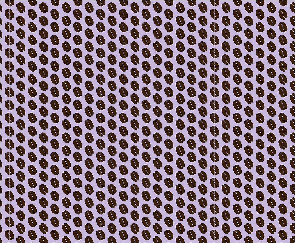
BrewHaus blends earthy espresso tones, soft neutrals, and pops of vintage color with bold typography and geometric shapes. The aesthetic nods to Bauhaus-inspired structure while keeping a relaxed, hand-crafted energy. It’s stylish but never sterile — the kind of brand that feels as good as it looks.
- Adobe Illustrator
- Adobe Photoshop
- Figma (for visual planning and mockup layout)
The result is a visually consistent and emotionally warm brand system that could live across packaging, social media, in-store signage, and beyond. BrewHaus is designed to be more than a coffee shop — it’s a visual experience that invites community, comfort, and creativity.
Project Overview
BrewHaus is a fictional coffee shop brand created to capture the essence of a cozy, design-forward café. Inspired by vintage packaging and neighborhood cafés, the goal was to build a visual identity that feels both warm and bold — a space that feels like home, but looks like a brand.
What I did
- Designed a full brand identity system including logo, color palette, and typography
- Developed the visual tone, brand voice, and design direction
- Created supporting brand assets and mockups for packaging and signage
- Crafted an aesthetic that blends retro charm with modern minimalism
Design Style
BrewHaus blends earthy espresso tones, soft neutrals, and pops of vintage color with bold typography and geometric shapes. The aesthetic nods to Bauhaus-inspired structure while keeping a relaxed, hand-crafted energy. It’s stylish but never sterile — the kind of brand that feels as good as it looks.
Tools Used
- Adobe Illustrator
- Adobe Photoshop
- Figma (for visual planning and mockup layout)
Outcome
The result is a visually consistent and emotionally warm brand system that could live across packaging, social media, in-store signage, and beyond. BrewHaus is designed to be more than a coffee shop — it’s a visual experience that invites community, comfort, and creativity.